Intro To Flexbox
Intro To Flexbox
Vocab
- Flexbox
- Bootstrap
display: flex;justify-contentflex-wrapflex-directionflex-flow
Warm Up
- What strategies have you used so far to position elements on the page?
- How do you feel about positioning in CSS?
- Rate your abilities to position elements on the page
Flexbox
- Introduced as syntax in 2015.
- Flexbox allows us to manipulate the position of tags without all the knowledge of a larger grid system.
- We can use a grid system (Bootstrap, CSS Grid, etc), which works fine but requires more digging into docs and base knowledge about how it works.
Using Flexbox
Setup
- Clone down this repo. Open the
index.htmlfile from your command line (For atom,atom open index.html). - Check out the CSS and HTML files to see what is going on.
Let’s play
- Check out the
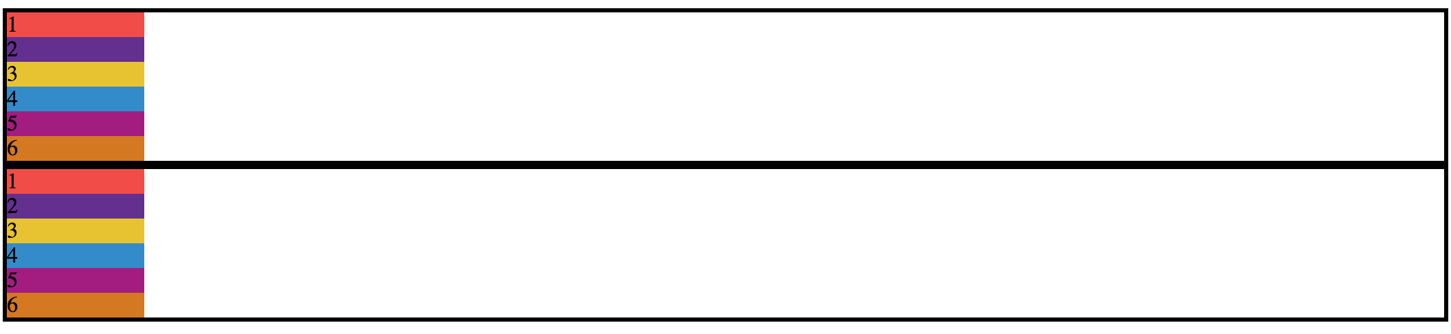
index.htmlandcustom.css - Right now, we have two sections, each with 6 boxes (each 100px in width).
- We have not set the width on the
.boxessections so they are taking up the entire width of the page.
Display: flex;
- First things first, we want all of those boxes in the
section class="boxes-1to be in a row, not a column but because of the default properties of adivbeing block, each one of these boxes is stacked on top of each other.
.boxes-1 {
  display: flex;
}
-
Each child of a flex container becomes a flex item. Text directly contained in a flex container is wrapped in an anonymous flex item.
- This tells our
boxes-1to turn into a flex container that we can now play with - By default, this property aligns elements inline within that container
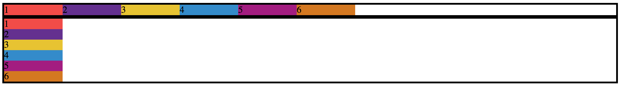
- What happened?
- Our boxes are set to their width of 100px and now in a row.
- We can also adjust the width and height of the section that is containing the boxes and the boxes themselves.
Flex-wrap
- Let’s change the size of our boxes to 500px and see what happens
- No matter how big the original boxes were, they will all fit into that section unless we change that option!
.boxes {
  display: flex;
  flex-wrap: wrap;
}
Justify-Content
- We can play with where the contents sits within this section!
- We want to center the boxes in this section.
.boxes-1 {
  display: flex;
  justify-content: center;
}
- Other options:
space-around,space-between,flex-start(default),flex-end
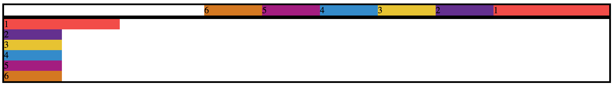
Flex-direction
- By default, the direction is
rowbut we can use other options such ascolumnand both in reverse,column-reverseandrow-reverse -
Let’s reverse our row in
boxes-1.boxes-1 { flex-direction: row-reverse; }
- A shorthand for both
flex-wrapandflex-directionisflex-flow
All Boxes Flex
- What about the other section of boxes?
- Let’s flex
.all-boxesand apply the some flexbox rules to it.
.all-boxes {
  display: flex;
}
Back to Dog Party
- With the time left, take another look at Dog Party and see if you can apply Flexbox to your layout.
Wrap Up
- What are the 5 main properties to use with Flexbox which we learned today? (There are many more, check out the resources below)
- What does each do?
- What are the possible arguments you can pass each property?